


Project: UI Design for The Good Card
Client: Better World International
The Good Card is an app conceptualized by the nonprofit Better World International, the aim of the mobile app is to encourage individuals & companies to do good deeds and share their stories with users of the app.
The core team of Better World International approached me to design the UI of the whole app. They wanted something that would arouse feelings of enthusiasm and optimism.
The purpose of The Good Card is to create a social movement where people engage in performing social deeds in a fun way. Through a gamified mobile-web based interface, users will be given missions to perform real social deeds. Through interaction with the application, players will be instructed what tasks they need to complete and when to complete them by. The target demographic are people who believe in the positive impact of service work, particularly millenials and retirees.
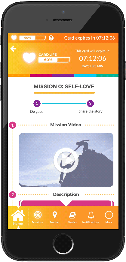
12 missions will comprise the game. These missions refer to the actual social deeds users will go and perform. There will be 12 missions spread throughout 12 months for long-term engagement. There will be a time limit for each mission in order to incentivize the user to perform the deed as soon as possible.
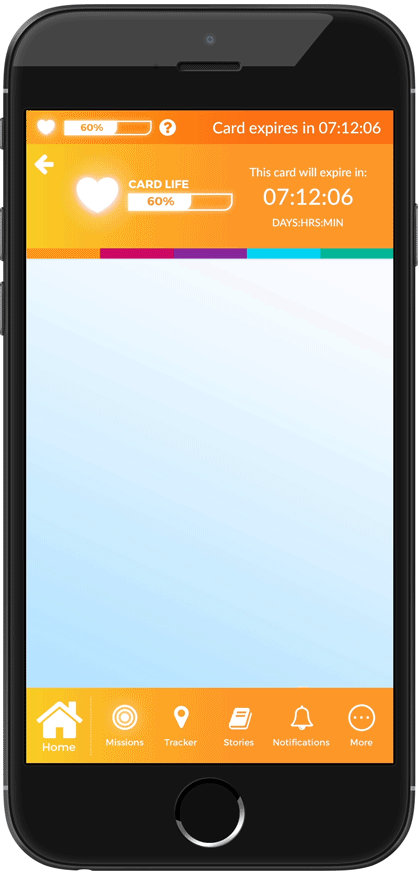
When it came to the design, I needed to update the branding of the Good Card from flat colors to one that uses a subtle gradient so as to give it a contemporary touch. One of the goals of the game is to bring joy by paying it forward. The first things that came to my mind were the colors yellow and orange, the universal tones for happiness. As a result, I merged the two into a subtle color gradient that matches the most recognizable design element of The Good Card, which is the 5-color stripe.
As for the user experience, I made sure that the timer and navigation are always present on the main screens, especially for the older users of the app. On each mission briefing screen, the steps are clearly labelled to guide the user on the sequence of actions he/she needs to take. Finally, the colors of the interactive elements e.g. buttons, icons, etc. all follow one of the 5 colors The Good Card is known for. This is to ensure consistency with the brand image.
Below is the design of the card needed to start playing the mobile app. I made use of the five colors and applied them to the border at the back of the card. Instead of going the solid color route, I smoothened the transition from one color to another to create gradient effects. The card's design, in turn, became consistent with the mobile app.
Below was an iteration of a character I designed for an earlier version of the mobile app. It would play very similar to Tamagotchi, which was a virtual pet simulator, but instead of feeding your pet with food, you feed it by sharing good deeds. The concept did not make it to the final version of the app due to development constraints.